Home / Students / Snapshot Trends
What Is the Snapshot Trends Graph?
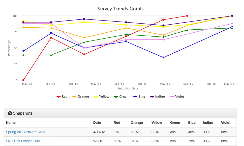
Trends is a line graph that shows how your ROY G BIV has changed over time. For each color, the line is made from the data points from all your survey results. For example, if you have completed three Kaleidoscope Snapshots (ROY G BIV), then you’ll have three sets of data points for each color in that line over time. If you did a ROY Snapshot, then you will have additional data points for those three colors in each of those color lines on the graph.
It can be interesting and informative to see how your Developmental Ecology is dynamic overtime. You may even be able to think about how things that were happening in your life at each time - when you took each Snapshot - may have been affecting your web of support and Developmental Ecology.
========================================
Seeing Your Trends Graph
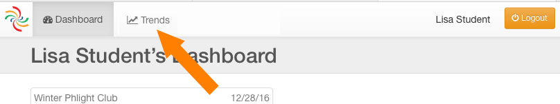
To see your Trends graph, login and click the Trends link at the the top of any page.
Your Trends graph will look something like the example below, depending on your results and how many Snapshots you have completed. Note that this page includes both the line graph and a table of all of your survey results (percentage for each color) below it.
========================================
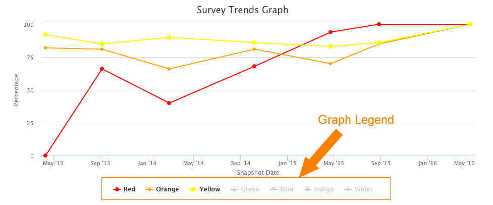
Manipulating Your Trends Graph
You can turn off/on each color on the graph to help you narrow the graph to one or just a few colors, if you want.
To do that, click the graph Legend just below the x-axis. If that color is “on”, then clicking it will turn it “off” - that is, remove it from showing on the graph. Click it again to turn it back on.
In the example below, Green, Blue, Indigo, and Violet have been turned “off”.